Feasting on Color
One may find economies in acrylic pouring by thoughtful shopping and price comparing, still the passion requires funds that for me are scarce. And as a beginner, what I want to do most is to make and experiment. So now, five weeks into this mission, I've created about 80 images and have had to think deeply on how to fuel my further exploration, while keeping myself housed and fed.
The search is for more substrates -- having used up the canvasses purchased -- the many 4X4s then 5X5s, 6x6s, 8x8s, 12x12s, finding a tile, buying some acrylic disks -- I remembered my stash of handmade paper and have used most of my delicious plant papers in service for the cause.
Nesting colors-- that's what delights me, the ring within ring within ring you can sometimes get in cells, the exuberances of one color shredding and sliding over another, other times peeking through. The skin and veins, the lacing and crochet, how resistant in base, other times how interpenetrant or how fused to become another color.
So I saw that some artists began pouring on records. I have a sizeable collection,
about 3k, so while constitutionally opposed to undoing precious vinyl, I considered choosing one less-loved to pour on. I have a batch of gift records
that include genres that are less dear. But something told me to check online.
And when I did, this artist I never heard of before, Ruggiero Ricci, was listed and his records were $10-40. So instead of pouring on it, I listed it and others in my collection, that I could part with, for sale. My copy of the Beatles' Revolver
sold promptly. Wonderful!
There's a search for paint, too. Since I can't get to the stores that offer savings, the prices for the less expensive paints online, don't match the savings for some name brands online...
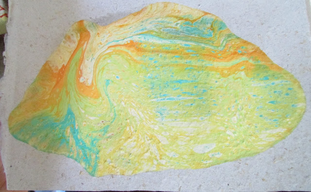
Then, this journey story, shared on FB, led to a batch of canvasses and new paints. One of my neighbors read of my interest and yesterday brought over canvasses and paint. The paint included colors that whispered to me: ivory, mango, turquoise, and they were liquidy in their little bottles. So prep was swift and easy. To these, I added a lemon-lime and an orange I created, and I was up all night pouring.
That combination is so delicious, I did it again and again, enjoying the ease of mixing the inexpensive acrylics with floetrol and water, the near immediacy of the process as compared to what I usually have to do when working with tubed paint.
It was instructive-- that ivory is warmer than white, and that mango was vibrant though lighter than orange, and the chord of turqoise-orange-lemonlime, had resonance... It is visual music as I doubled the orange note but in another register
and thought, blue-yellow blue, yellow-red, yellow yellow-blue. Yellow is one of my favorite colors and so while this combination does not express yellow directly, the colors all have a yellow connection.
I mix colors, thinking of their order. The first color in the cup will be on the top, the last color in the cup will be on the bottom. But density holds sway and delightedly I watch what sinks and what floats in the cup. I poured high and there's a delight in that action, in seeing the colors enter each other and make cells and shapes in the cup.
And after the pour, the wonder of what remains in the cup, sometimes striped, somtimes celled and shimmering is another delight.
My last pour, around dawn, was an aha! I thought about atcs and had some heavy matboard/backing board weight atcs in my stash. They made a mini triptych. I must try the multiple surface approach again!


The search is for more substrates -- having used up the canvasses purchased -- the many 4X4s then 5X5s, 6x6s, 8x8s, 12x12s, finding a tile, buying some acrylic disks -- I remembered my stash of handmade paper and have used most of my delicious plant papers in service for the cause.
Nesting colors-- that's what delights me, the ring within ring within ring you can sometimes get in cells, the exuberances of one color shredding and sliding over another, other times peeking through. The skin and veins, the lacing and crochet, how resistant in base, other times how interpenetrant or how fused to become another color.
So I saw that some artists began pouring on records. I have a sizeable collection,
about 3k, so while constitutionally opposed to undoing precious vinyl, I considered choosing one less-loved to pour on. I have a batch of gift records
that include genres that are less dear. But something told me to check online.
And when I did, this artist I never heard of before, Ruggiero Ricci, was listed and his records were $10-40. So instead of pouring on it, I listed it and others in my collection, that I could part with, for sale. My copy of the Beatles' Revolver
sold promptly. Wonderful!
There's a search for paint, too. Since I can't get to the stores that offer savings, the prices for the less expensive paints online, don't match the savings for some name brands online...
Then, this journey story, shared on FB, led to a batch of canvasses and new paints. One of my neighbors read of my interest and yesterday brought over canvasses and paint. The paint included colors that whispered to me: ivory, mango, turquoise, and they were liquidy in their little bottles. So prep was swift and easy. To these, I added a lemon-lime and an orange I created, and I was up all night pouring.
That combination is so delicious, I did it again and again, enjoying the ease of mixing the inexpensive acrylics with floetrol and water, the near immediacy of the process as compared to what I usually have to do when working with tubed paint.
It was instructive-- that ivory is warmer than white, and that mango was vibrant though lighter than orange, and the chord of turqoise-orange-lemonlime, had resonance... It is visual music as I doubled the orange note but in another register
and thought, blue-yellow blue, yellow-red, yellow yellow-blue. Yellow is one of my favorite colors and so while this combination does not express yellow directly, the colors all have a yellow connection.
I mix colors, thinking of their order. The first color in the cup will be on the top, the last color in the cup will be on the bottom. But density holds sway and delightedly I watch what sinks and what floats in the cup. I poured high and there's a delight in that action, in seeing the colors enter each other and make cells and shapes in the cup.
And after the pour, the wonder of what remains in the cup, sometimes striped, somtimes celled and shimmering is another delight.
My last pour, around dawn, was an aha! I thought about atcs and had some heavy matboard/backing board weight atcs in my stash. They made a mini triptych. I must try the multiple surface approach again!


Comments
Post a Comment